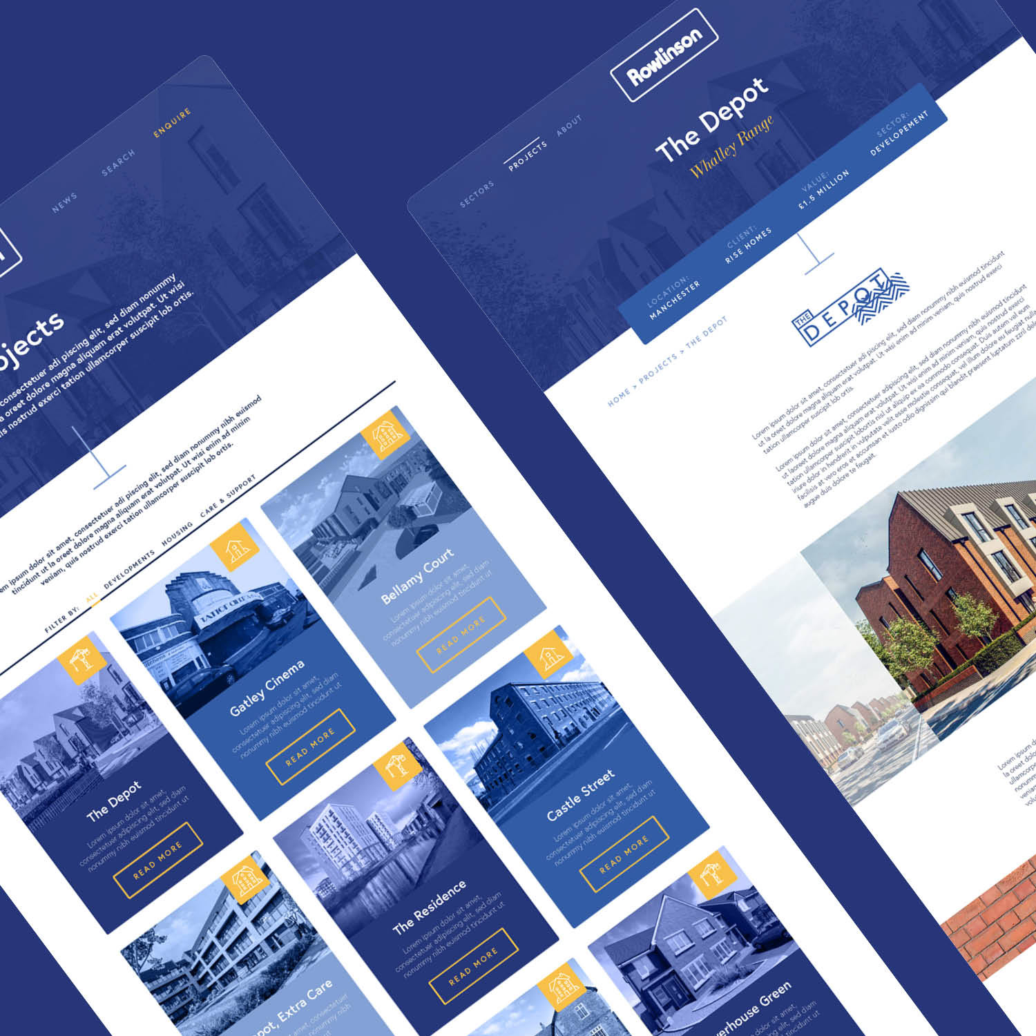
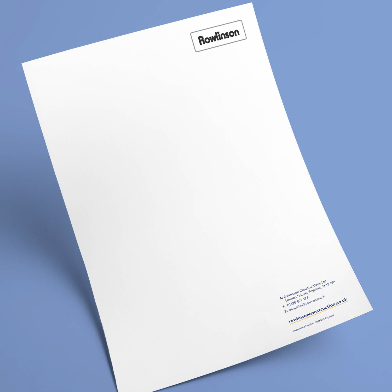
Rowlinson Construction wanted to refresh their brand. The new suite, that included a website and updated stationary, feature a new colour palette, alongside photographic textures incorporated in the form of close-ups of architectural features.
The clean new look has given them a fresh professional platform to showcase the cutting-edge projects they’re spearheading.

Business Cards

Website Subpages

Letterhead
Project completed for Future Design Consultants: www.designbyfuture.co.uk